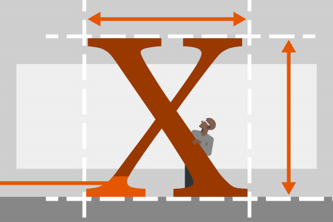
Good typography can add tremendous power to your design and your message, whether it is a print- or screen-based project, a still or motion graphic, a 3D or 2D graphic. This course explains good typographic practices, so that you can develop an “eye” for type and understand how to effectively use it. Author Ina Saltz explains type classifications (serif vs. sans serif, display type vs. text type), how type is measured, sized, and organized, and how spacing and alignment affect your design. She also explains how to use kerning, tracking, leading, and line length, and covers the history and current trends in typography. The course teaches the principles of legibility, readability, and compatibility, and how they should be considered when you’re selecting and designing with type.
Learn More

